VISUAL IDENTITY
Poppi Red
Restaurant & Rooms
INDUSTRY:
2023
YEAR:
poppired.co.uk
WEBSITE:
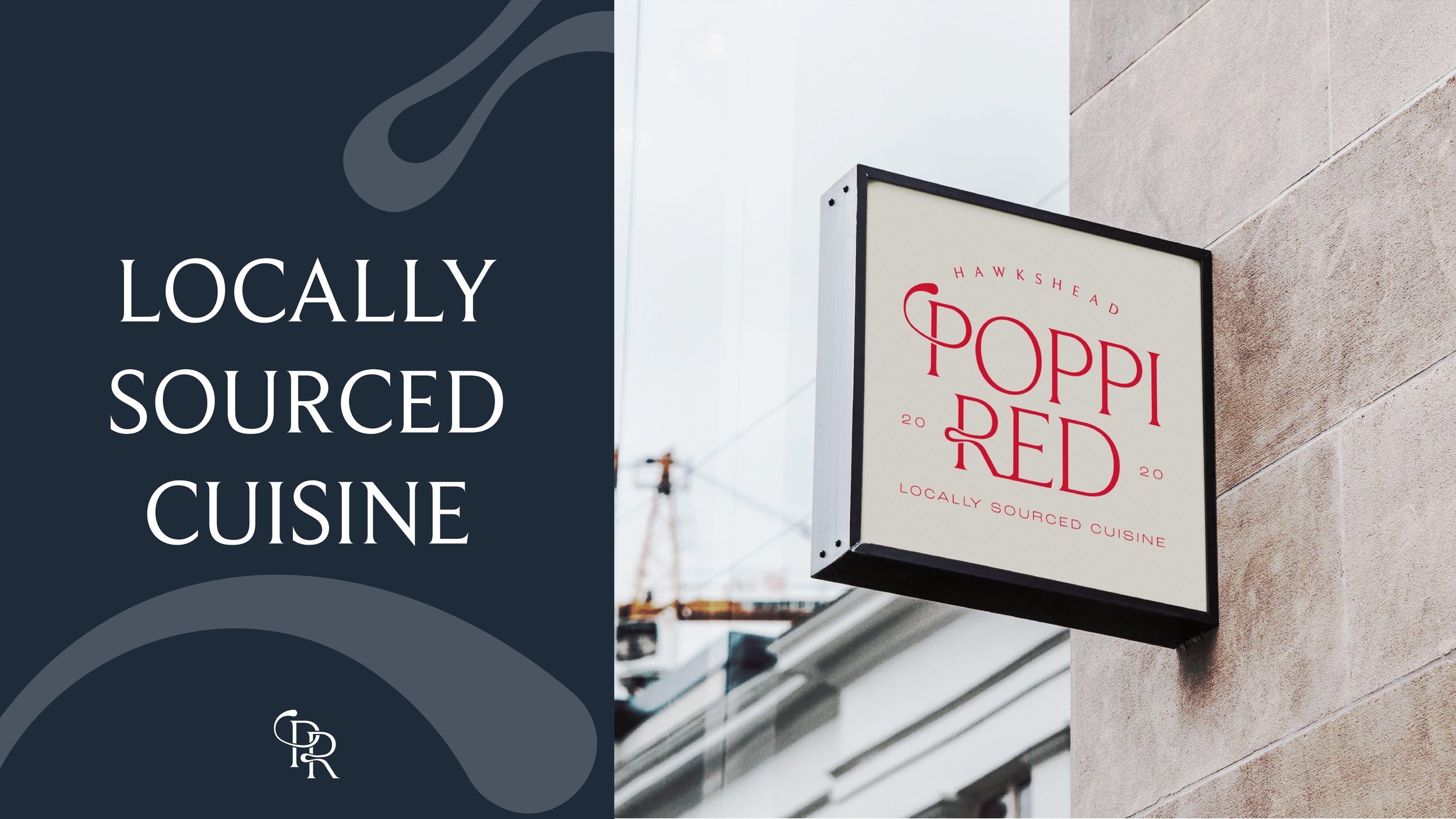
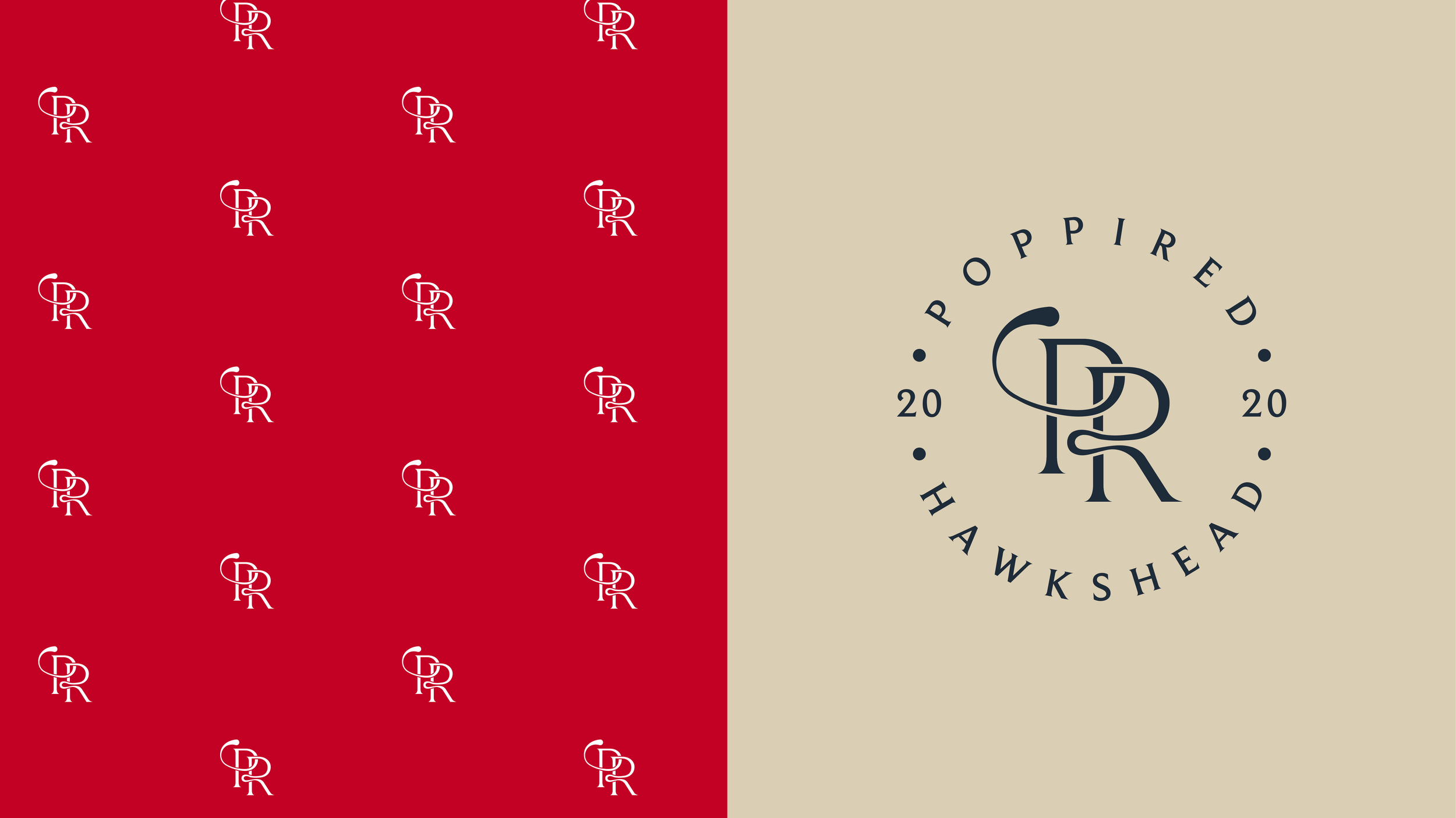
Poppi Red is a long-established eatery in Hawkshead that recently underwent a full renovation, with refined interiors, elevated dining and boutique rooms. Their identity, however, no longer reflected the quality or character of the experience. We set out to realign the brand with this new chapter, creating a sophisticated visual identity centred around an elegant logotype, a flexible wordmark system and a monogram used across menus and marketing materials. Inspired by the restaurant’s interiors, we introduced bespoke illustrations and a refreshed colour palette that elevates the signature red, resulting in a cohesive and contemporary brand worthy of its revitalised space.