Crag+Crest Consulting
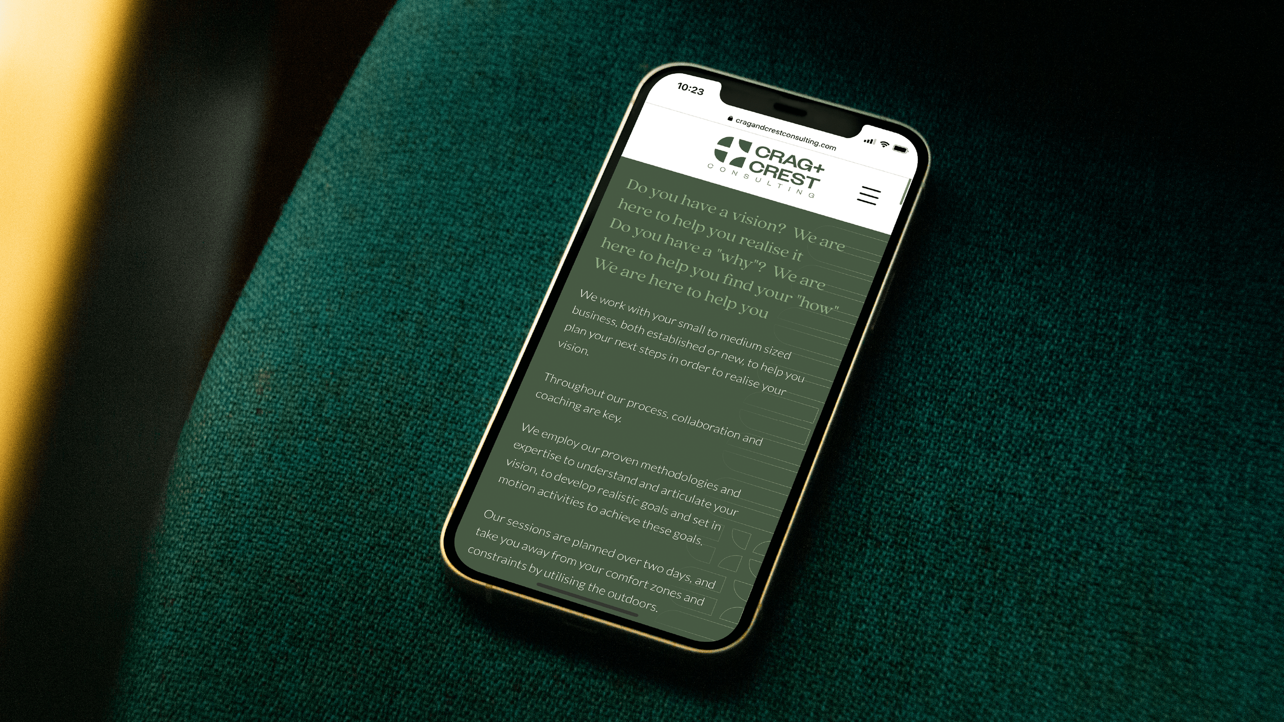
  • Crag+Crest are a business consultancy & advancement service based in the Lake District who help clients define, document and deliver their business vision.

  • Our goal was to develop a contemporary and professional identity - ensuring the friendly and adventurous nature of the brand was also communicated through various creative strategies.

  • To begin with, we set out to redefined Crag+Crest's (C+C) brand strategy, honing in on the key elements that encapsulate their vision, values, and unique character. Our approach brought the C+C mark to life—a striking visual symbol that embodies the discovery, realignment, and execution of a business's vision, forging a thriving organization.


    We then designed two bespoke patterns, each illustrating the distinctive journeys organizations embark on to realize their vision. The second pattern employs a "lock & key" motif, dynamically evolving to represent the clarity emerging throughout a client's journey. We've crafted a captivating colour palette, echoing C+C's adventurous spirit and connection to the picturesque Lake District, while ensuring seamless accessibility for their website redesign. The result? A compelling, unified brand identity that eloquently conveys Crag+Crest's unwavering commitment to collaboration and achieving the extraordinary.

Previous
Previous

Tallulah Rose Flower School

Next
Next

Poppi Red